With an ever-increasing iPad audience, knowing how to create a compatible site is essential. 12 key tips recommend for iPad-friendly site design
With the release of Apple's IPad, audiences now have a new way of browsing the internet. Accordingly, we have to build iPad-compatible sites for optimum viewing.Here, we'll look: at the specifics of designing a site that can be viewed on iPad, taking into account the device's screen dimensions. We'll also look at arranging your content in different ways to account for the change in orientation.
This design will be a mobile version of a website, and when the iPad is spun from portrait to landscape and back again, the content's layout changes rather than the page being scaled. Your design could be used to work across both desktop and mobile devices, or it could be used as an alternative to an existing Flash site when viewed on iPad.


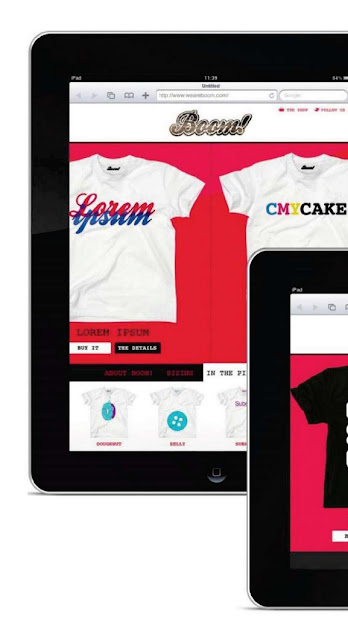
01 - I like to have an outer image of an iPad surrounding my design so I can see
exactly how it will look on the device.
I don't do this with site designs for desktop, but they can't be viewed in both portrait and landscape modes.
You can download an iPad template at www.computerarts.co.uk/designforipad .
exactly how it will look on the device.
I don't do this with site designs for desktop, but they can't be viewed in both portrait and landscape modes.
You can download an iPad template at www.computerarts.co.uk/designforipad .

02 - The first thing to get used to is the fact that iPad has a screen resolution of 1024x768. That's the full screen, though.
When designing your site, you have to take into account the bar showing the time and power level, plus Safari's address panel. This occupies up to 78px of viewable height, depending which way round you have the iPad.
When designing your site, you have to take into account the bar showing the time and power level, plus Safari's address panel. This occupies up to 78px of viewable height, depending which way round you have the iPad.

03 - Another point to remember is that, while browsing on iPad feels fast, its processor isn't as powerful as that of your desktop machine.To maintain the speed, you need to cut back on excess graphical weight. In this example, we use strong background colours rather than background images, and we've simplified the corners of the buttons.

04 - Think about the homepage's function. This site's purpose is to sell T-shirts, so we go straight into the various designs. The design for the site makes good use of the available browser space, so there's no need to scroll down in order to see more content. The site's logo and header stay locked to the top of the screen, and the navigation bar stays locked across the bottom.

05 - A person's fingers are larger than a mouse pointer, so there's the possibility that a user's hand could obscure what you want to show in your site design. Because of this, links, navigation elements and buttons should be made particularly clear and large.

06 - To move through the list ofT-shtrt designs, the central part of this page has a horizontal scroll using touch-gesture panning. This can be done using the jQuery Swipe gesture. For technical details on this, read more at http://plugins.jquery.com/project/swipe .


08 - The bottom panel contains other information for this site, such as the 'About'details, sizing info and upcoming shirt designs. To retain the'app'feel of the site, we don't leave the homepage to view the extra information - it all remains self-contained. When one of the links is clicked, the bottom panel pops up. Clicking the link again drops the panel back down.

09 - We move to a different page when the Details button is clicked.To show the transition, we've changed the background colour. To keep the page clear of clutter, the bottom panel is removed, while the images are
navigated through in exactly the same way as on the main site page.
navigated through in exactly the same way as on the main site page.

10 - Take a look at what happens when you turn the iPad to landscape view. When on the front page, the layout changes, but as we've allowed for this everything still fits. However, when we open the bottom panel we move the product images up beneath the header. Clicking outside the panel closes the panel.
This process helps to reinforce user-familiarity with the site no matter what format it's viewed in.
This process helps to reinforce user-familiarity with the site no matter what format it's viewed in.

11 - You may need as much of the available browser height as possible in your design. If this is the case, you could move items to different parts of the page, such as the navigation or ad banners. We've moved the product details to the right when in landscape mode, allowing the product images to stay the same size. We still scroll through them in the same way, though.

12 - Check the look of your site regularly. You can view your design as it would look by exporting the design as a series of JPEGs and syncing them to your iPad, enabling you to view them from your Photos app.
No comments:
Post a Comment