reveals her workflow tips forwireframing and designing iPad apps
iPhone and now iPad are still relatively new mediums for designers to work in; considering how long we've had to hone and develop our skills as graphic and web designers, these devices are still very much in their infancy. In this tutorial I'll be taking you through the process of designing a train timetable app for the iPad - nothing too fancy or complex, as we'll be focusing on the process and the'how to; but I will show you basic principles you can port across to each project you work on. For the purposes of this tutorial, we're going to pretend we are pulling the train details in from a compatible API source.

Sarah Parmenter
■ Owner of Essex des?gn studio You KiowWho, Sarah Parmenter specialises in user interface design for websites, i Phone
appsandiPadaocs.
She founded the studio in 2003. See more of Sarahs work at wwwyouknowwhodesign.com
■ Owner of Essex des?gn studio You KiowWho, Sarah Parmenter specialises in user interface design for websites, i Phone
appsandiPadaocs.
She founded the studio in 2003. See more of Sarahs work at wwwyouknowwhodesign.com


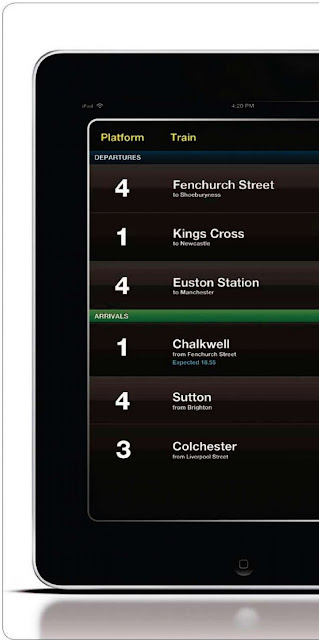
Once you've got your app idea, you need to categorise it clearly, as this will determine what it looks like later on in the process. We can do this easily by using the Apple HIG (Human Interface Guidelines) graph. Serious Entertainment, Fun Entertainment, Utility, Serious and Fun tools all have a specific look and feel to their user interface, and they are all very different from one another. For this tutorial, we'll be designing a utility tool, so the dot on the graph will sit dead centre.


You can now start producing some wireframes. The key is to not produce them in too much detail; they are meant to be a step up from your paper sketches but only use block colours, block graphics, and don't get bogged down in the finer details.


Pro tip: Templating
When treat nq a wireframe in Photoshop, it can be handy to visualise your app within the Pad's nterface. In order to do sc, you can downlead a PSD template from here; http www.computerarts.co.uk/designforipad
When treat nq a wireframe in Photoshop, it can be handy to visualise your app within the Pad's nterface. In order to do sc, you can downlead a PSD template from here; http www.computerarts.co.uk/designforipad


Pro tip: Help files
Apple's own Developer Agreement and XCode IDE have some pretty stria rules and regulations, so make sure you read and understand them. What's more, check put some of rne other developer guides available through Apple, such as The Programming Guide and Human Interface Guidelines, Vou can download them here: www.developer.apple.com/ipad/sdk
Apple's own Developer Agreement and XCode IDE have some pretty stria rules and regulations, so make sure you read and understand them. What's more, check put some of rne other developer guides available through Apple, such as The Programming Guide and Human Interface Guidelines, Vou can download them here: www.developer.apple.com/ipad/sdk

If possible, your icons shouldn't contain any text and should use some of the same textures and gradients that you have used in your app. You want to give potential buyers a feel for the high quality of the Ul that you have gone to the trouble of designing. Don't forget your Spotlight (29x29px), iPad (72x72px) and Large (512x512px) icons when designing your set.

on to your developer. I've put together a comprehensive single screen of how the app will work, covering all
eventualities I can foresee and also documented how the app works for the developer.

No comments:
Post a Comment